

Working at Clerk
Building the future of Auth
Scroll Down
Role: Staff Designer responsible for Ceramic, Clerk’s dashboard design system, with subsequent ownership of Mosaic and core product design.
Mission: Rebuild the Clerk dashboard design system as a production-ready foundation with light and dark themes, then extend consistency and quality across Mosaic and core product surfaces.
Ceramic 1.0
Ceramic is Clerk’s product design system for the dashboard: the interface where customers configure authentication. I was hired to rebuild it end to end, covering foundations, components, light and dark mode, and a visual language that felt unmistakably Clerk.
I built the system as the sole designer. After roughly nine months, Ceramic was stable enough to support ongoing implementation by design engineers, and my focus expanded to Mosaic and product design.
Spacing
A consistent spacing and radius scale creates visual rhythm and predictable layouts. Each value exists as a reusable token, which simplifies alignment across the interface.
Typography
The typographic system defines text styles as design tokens and is kept intentionally lean. Sizes and line heights are applied through variables so type adapts cleanly from desktop to mobile.
Label 3
Icons
A unified icon system in duotone and monotone, built on consistent stroke, size, and grid rules. Icons stay clear at any scale and adapt automatically to semantic colors.
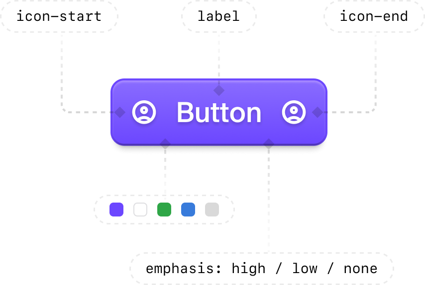
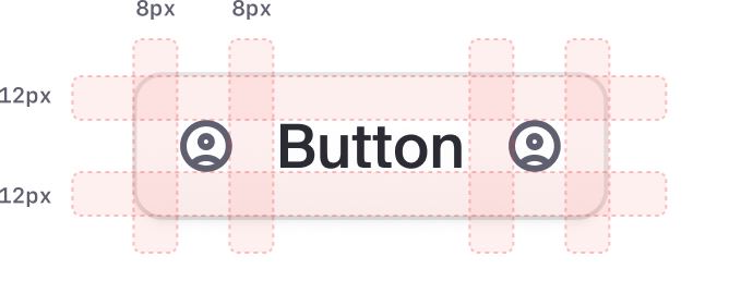
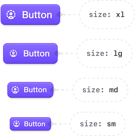
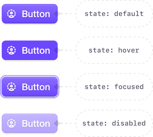
The result is a complete, versatile set of components: clear for designers and precise for engineers.
Here are a few core atoms.



Inputs grew into full field systems: labels, optional badges, helper text, extensions, and validation. Even a single field is a composition of atoms. Below is the field input with its configurable attributes:


Molecules
A few molecule examples. This isn’t the full set — only a selection I could show here.


Morem ipsum dolor sit amet, consectetur adipiscing elit. Nunc vulputate libero et velit interdum, ac aliquet odio mattis. Class aptent taciti sociosqu ad litora torquent per conubia nostra, per inceptos himenaeos.

Ensure protection of user credentials against aggressive unauthorized attempts


Organizations are limited to the following number of members, including pending invitations.

Organizations are limited to the following number of members, including pending invitations.


Choose how many test users you want to generate. Max of 5,000










Security. Manage this sensitive user. Learn more
What made Ceramic effective was not only the Figma file. Clerk holds a high standard across design and engineering, and UI and product engineers treated design with real care. One design engineer implemented components exactly as specified, including light and dark modes, so Figma and code stayed closely aligned. That fidelity made tooling like Cursor unusually productive against the system. I also shipped small production changes when extending patterns such as badges or segment pickers.
Light and Dark mode
Ceramic ships light and dark from the same semantic tokens. This case study is built using those variables, so using the segment picker below will allow you to control the theme of this case study.
Use this segment picker to switch modes
Mosaic
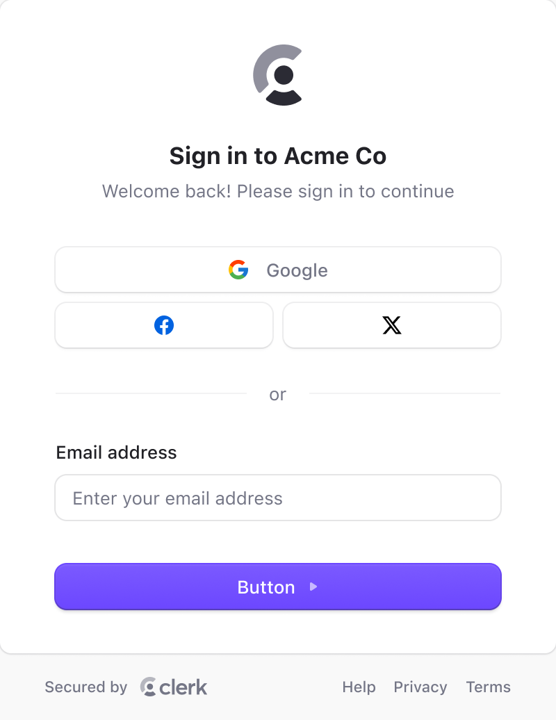
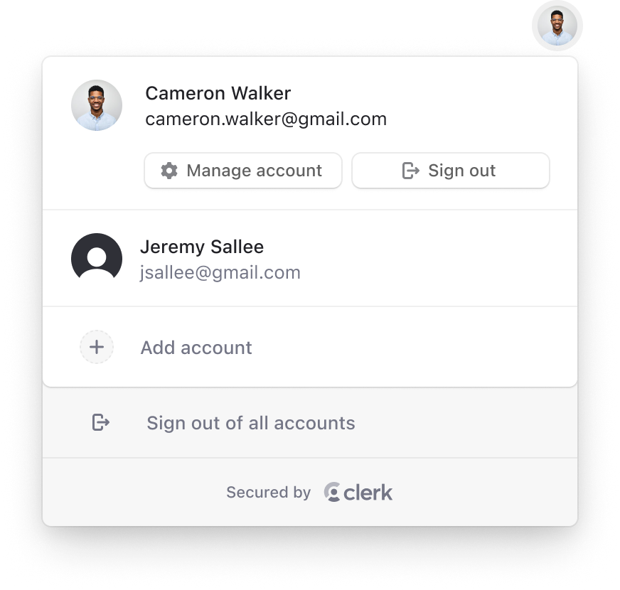
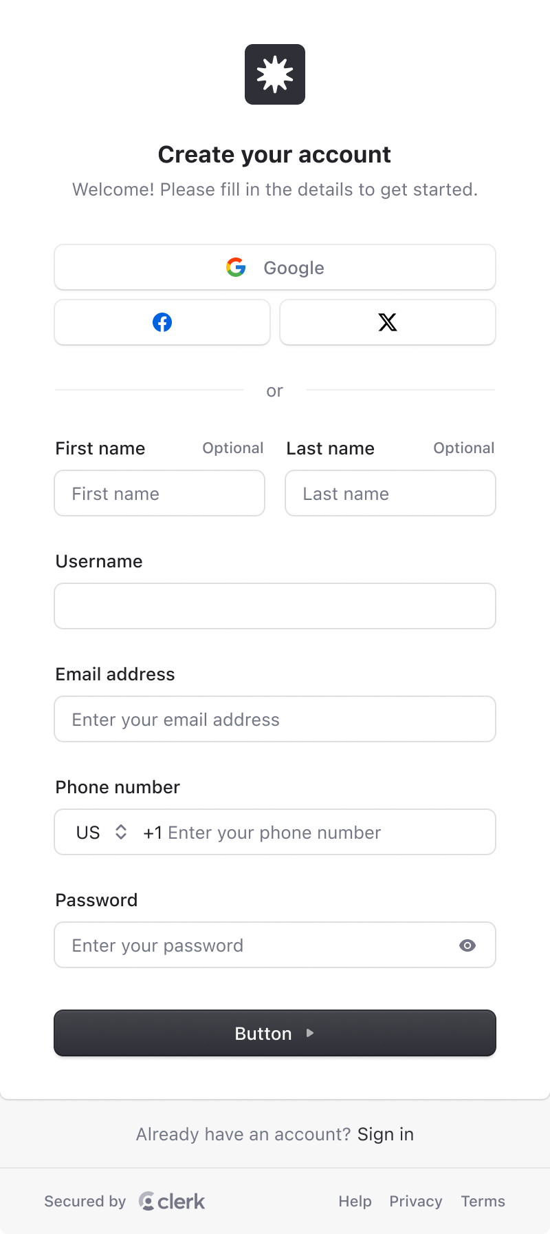
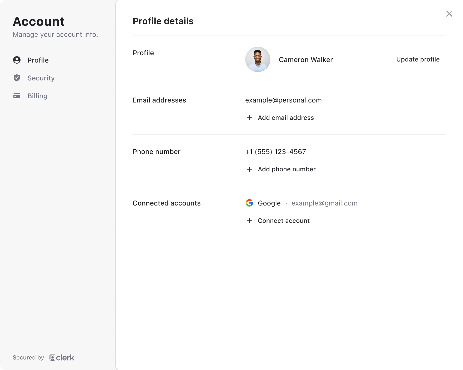
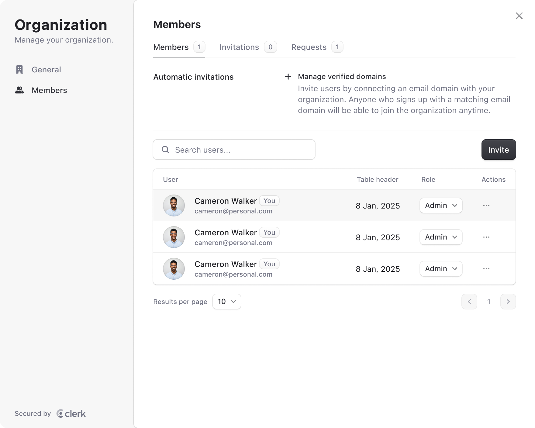
Mosaic is Clerk’s public-facing design system. Because Clerk embeds authentication into customer products, Mosaic gives teams control over the style, layout, and behavior of Clerk components.
The Figma Mosaic design system lets designers produce branded mockups and hand them off cleanly to engineering.
Product Design
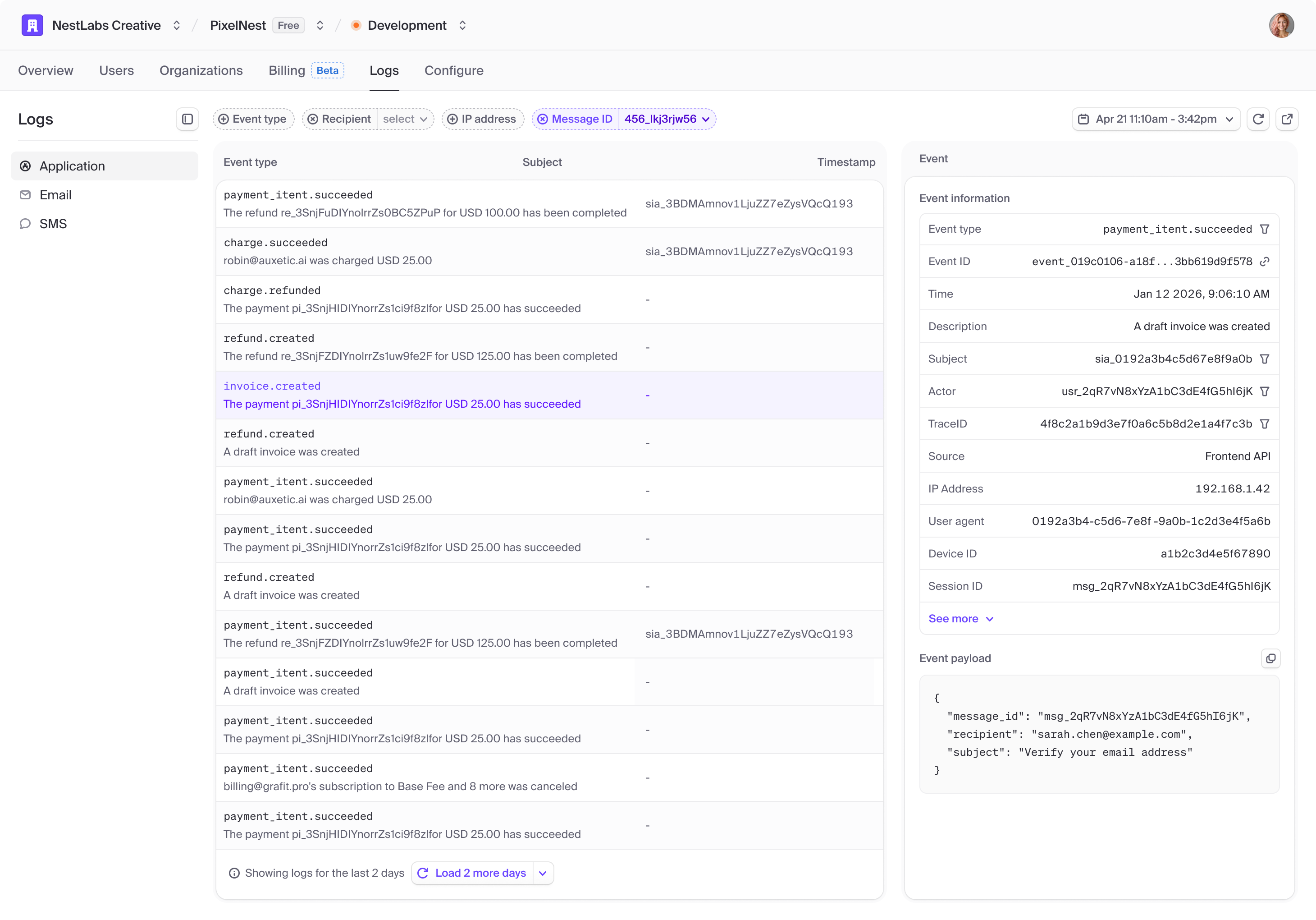
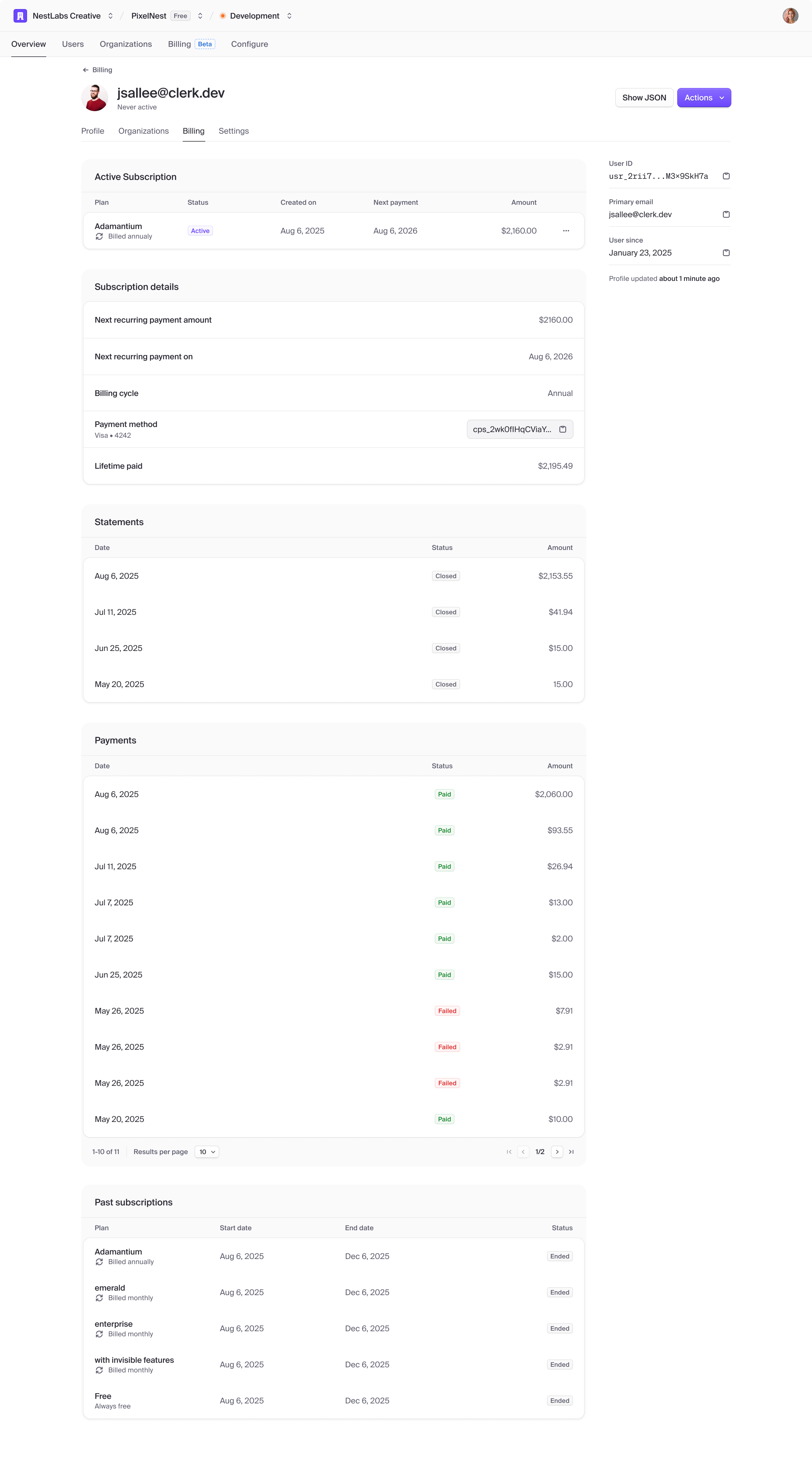
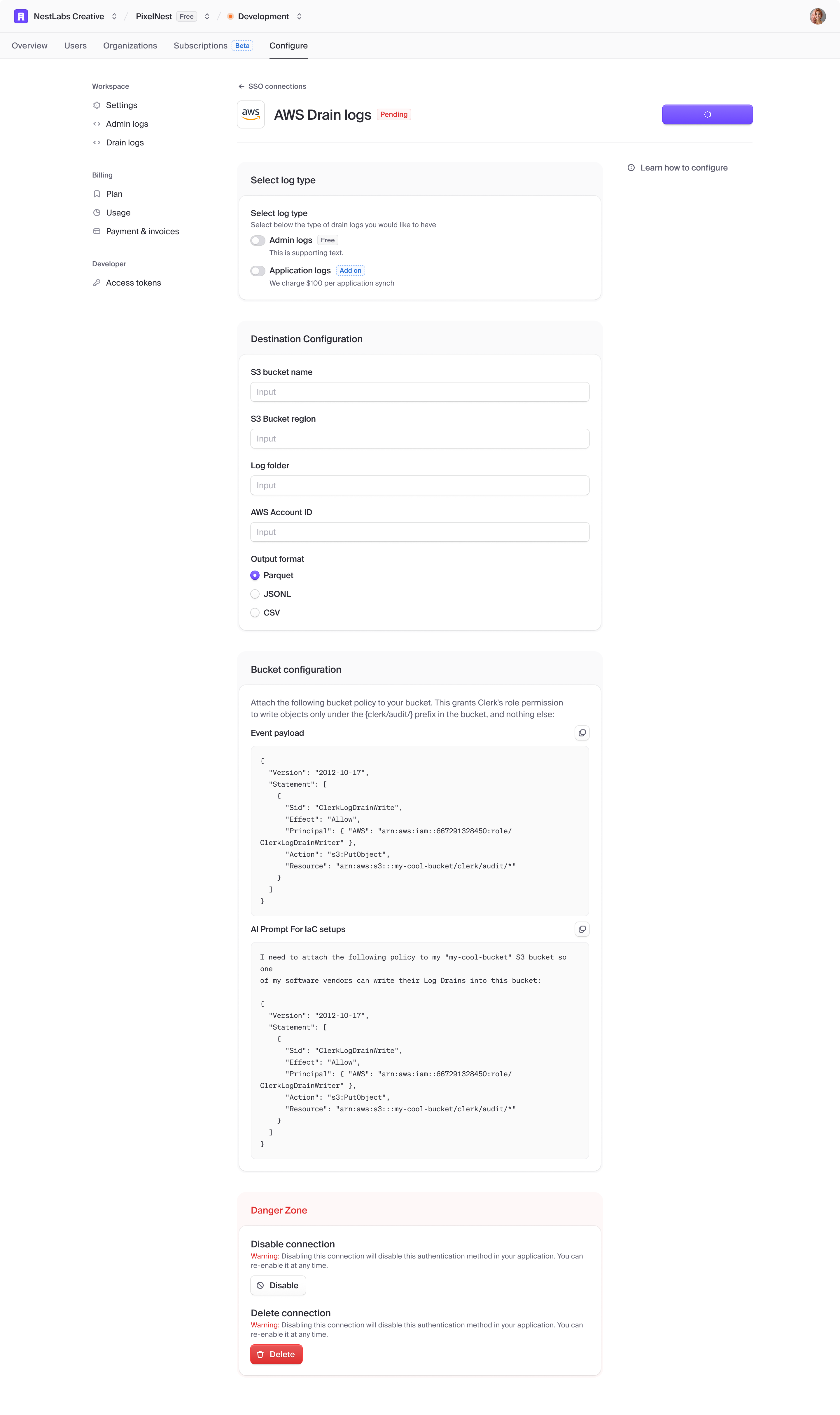
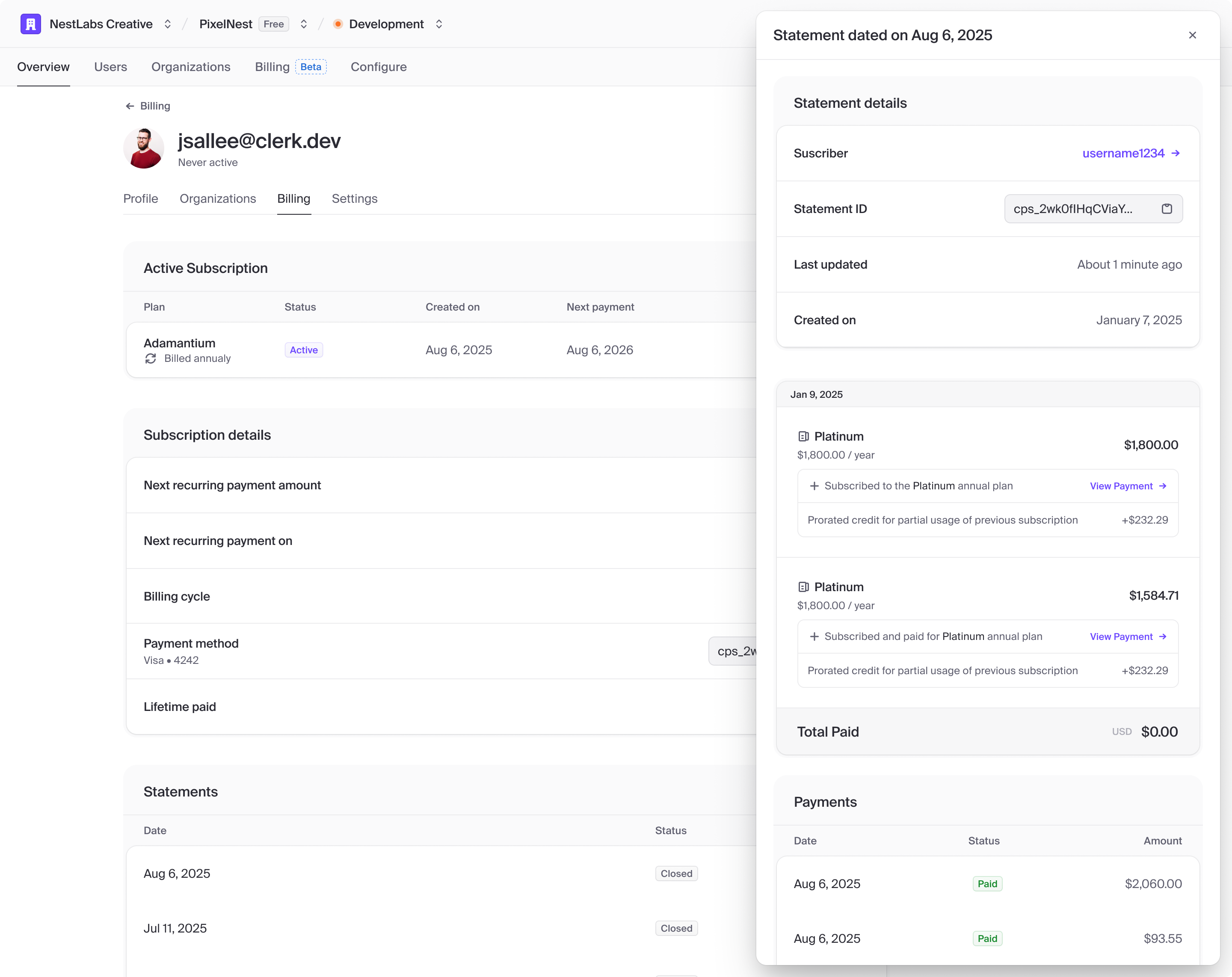
Once Ceramic was established, I took on more product work. Clerk’s dashboard covers dense domains such as auth configuration, organizations, billing, and observability, and every surface is expected to feel as considered as the marketing site. System logs was one of the harder problems: making high-volume event data readable without sacrificing depth for debugging.
What I took away
Clerk was the first place I worked where design, engineering, and marketing held a consistently high standard. Operating at that caliber was motivating, and it was meaningful to own a missing foundational piece: a design system strong enough for the full product to rely on. The role spanned design systems, product design, customer-facing theming, and hands-on production shipping.